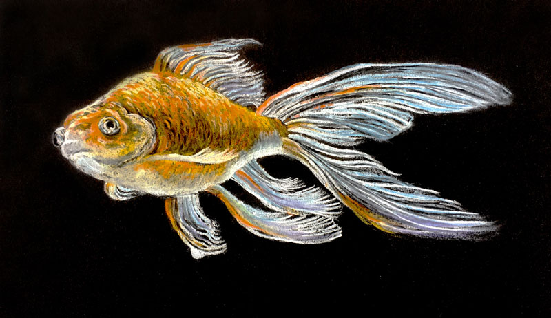
In this pastel lesson, we'll create a quick sketch of a brightly colored goldfish with pastel pencils on black paper. Since we're working on black drawing paper, the resulting image is bright and strong in contrast.

Pastel pencils provide us with a level of control that some may find difficult to achieve with traditional pastel sticks. Because a pencil can be sharpened to a point, we have more control over the details that are developed. But since the material within the pencil is pastel, we still benefit from all of the best characteristics of traditional pastels such as intense colors, the ability to layer applications, and bold mark making.
The paper featured in this lesson is smooth while most pastel surfaces for drawing are usually coarse. This results in smoother transitions of color and value, but limits the number of layered applications that can be applied. However, since the paper is black, we benefit from the strong contrast that results from applying bright, bold colors.
(Some of the following links are affiliate links which means we earn a small commission if you purchase at no additional cost to you.)
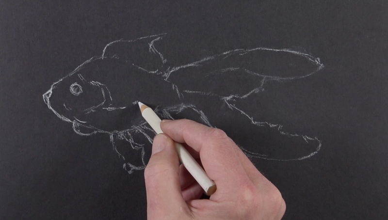
We'll begin the drawing with a loose contour sketch. We'll focus mainly on the basic shapes of the goldfish, planning out the body and each of the fins. No details are addressed with this initial sketch, however the eyes and the gills are positioned. White is chosen simply because it provides ample contrast with the black paper.
After the initial sketch is in place, it is gently lifted with a kneaded eraser, leaving a lighter version of the drawing. This step also helps to lessen the dust produced by the softer pastel pencils.
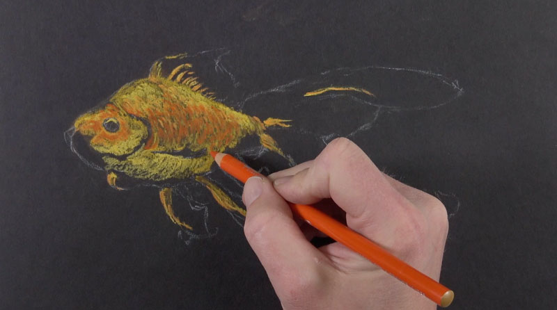
We can now begin the process of developing the colors. Using a variety of oranges, we'll pull strokes around the form of the body of the fish. These strokes are referred to as "cross contour lines". Making strokes of color in this manner not only helps to create the illusion of form, but also lays the groundwork for developing the texture of the body.
Lighter yellow-oranges are used for the upper and lower portions of the body to indicate the light source and lighter underbelly. Slightly darker oranges are used for the middle section of the body. Strokes are short and deliberate in order to communicate the texture of the body.
Much of the body of the goldfish and the fins are very light with some sections featuring tones close to pure white. We'll start to define these sections with an application of the white pastel pencil. The lower underbelly, portions of the eyes, the fins, and the top portions of the body all receive applications.
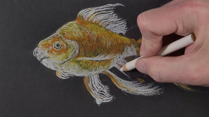
At this point, we have applied softer pastel pencils. Although these pencils produce strong applications of color, they smear and smudge quite easily. This is amplified since the paper is so smooth. Before developing the details further, we'll apply a workable fixative to reduce the smudging.
Once the fixative has dried completely, we can revisit the work with the harder pastel pencils. We'll begin by defining a few of the details with a black pencil. Areas around the eyes and portions of the body are addressed. Since this pencil is harder, it is easily worked into the weak tooth of the paper, producing an even appearance.
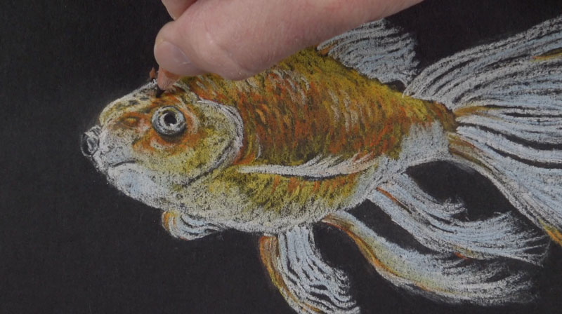
Gray and light blue are also applied with a harder pastel pencil, mainly to portions of the underbelly and the fins.
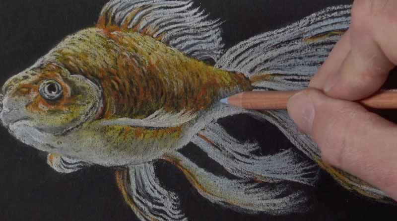
Using the harder black pastel pencil, we can further refine details on each of the fins. Lines are pulled outward from the body in order to further differentiate the patterns found on each fin.
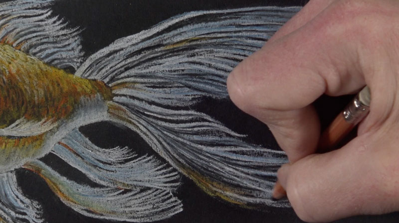
A bit of purple is added to provide additional color and interest to selected fins. Bright orange is added once again to the main body of the fish and a few of the fins. The addition of these applications strengthens the contrast further and brightens the image.
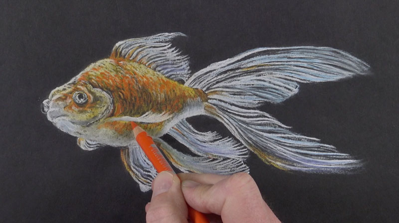
Lastly, we'll use the kneaded eraser to clean up any stray marks or smudges and define the edges. Our finished drawing is bright, lively, and high in contrast.
